SIGNAL & STEAM.
A precise new home for a personal idea. The cup stays. The steam keeps its swept-back character. Everything around it becomes clearer, bolder, and easier to use.
A FAMILIAR MARK. A FIRMER HAND.


Three rising ribbons recall the original steam and the founder’s father’s swept-back hair. A solid cup replaces the sketch outline. The icon works in one ink; the wordmark carries the full name.
THE COFFEE GETS THE BIG TYPE.
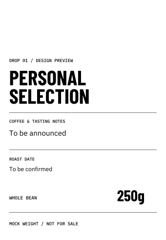
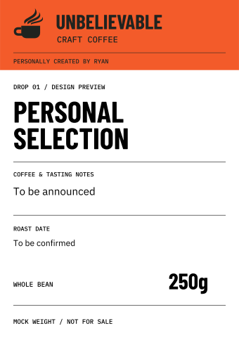 UCC / COMPLETE PROOF ↗PREPRINTED HEADER / SVG ↗BLACK THERMAL LAYER / SVG ↗

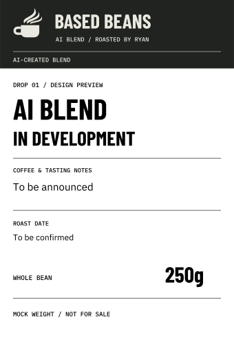 BASED BEANS / COMPLETE PROOF ↗PREPRINTED HEADER / SVG ↗BLACK THERMAL LAYER / SVG ↗

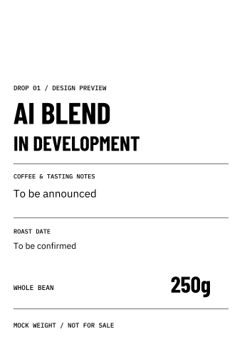
Designed for Ryan’s existing white bags: one label per bag, two reusable header stocks. Orange for UCC, charcoal for Based Beans. The supplier preprints the header; the thermal printer adds only the black coffee details below. No second sticker to align.
90 × 130mm proposed label, with separate preprint and thermal artwork at the same dimensions. These are layout proofs with mock 250g weights and unselected coffees. Actual bag fit, stock dimensions and printer calibration still need a physical check.
 BUNDLE BAND / VECTOR MASTER ↗
AI-generated packaging visualization. The flat label masters above are authoritative for text and layout; the bags and photograph are a concept.
RECOGNIZABLE IN EVERY FORMAT.
 AVATAR / 1080 × 1080 ↗
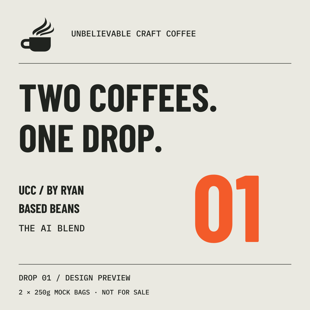 DROP POST / 1080 × 1080 ↗
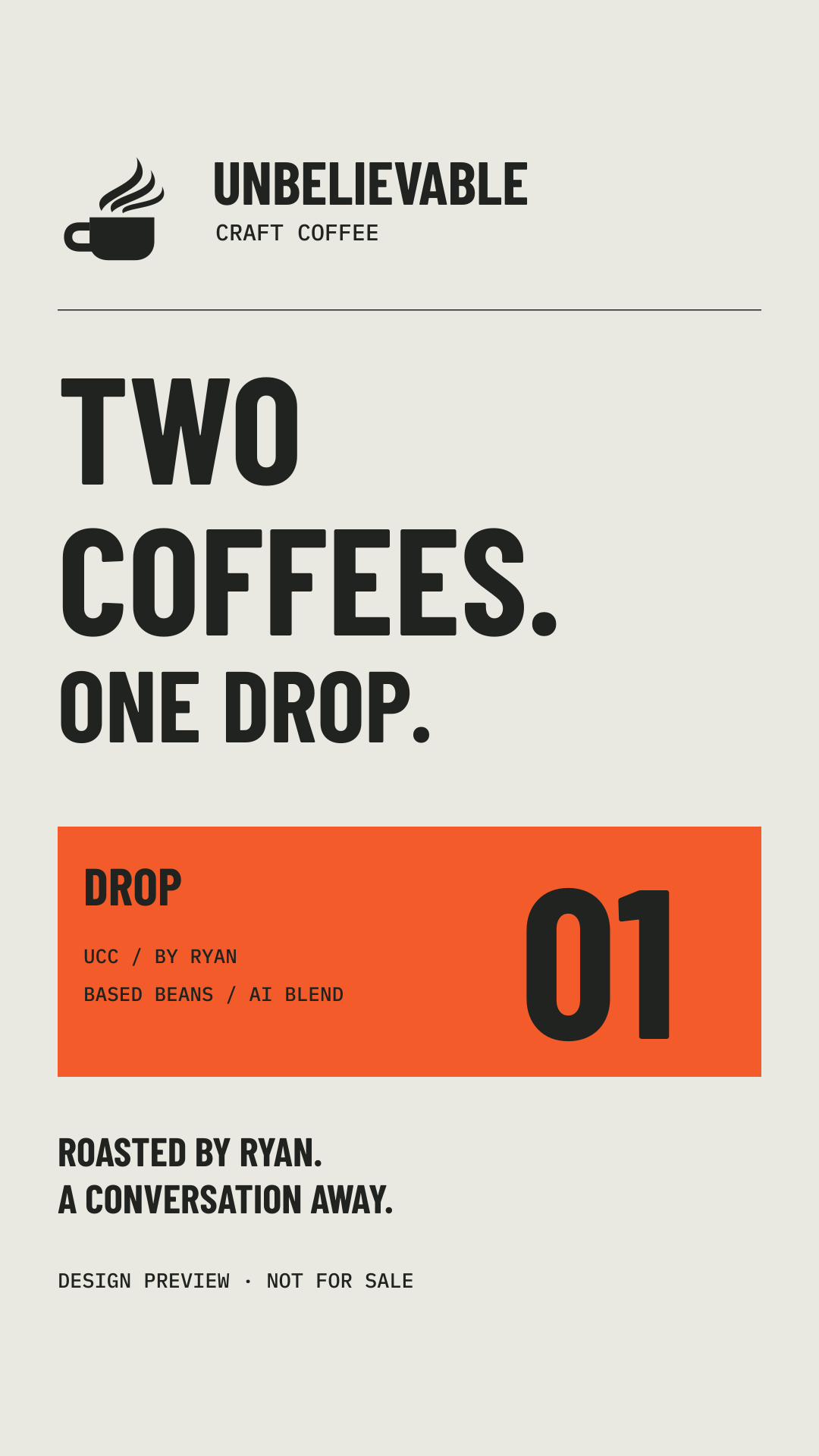 STORY / 1080 × 1920 ↗
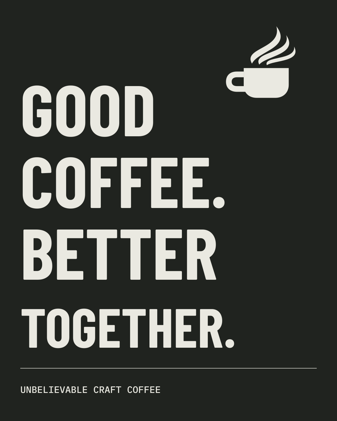 BRAND POST / 1080 × 1350 ↗
 HEADER / 1500 × 500 ↗
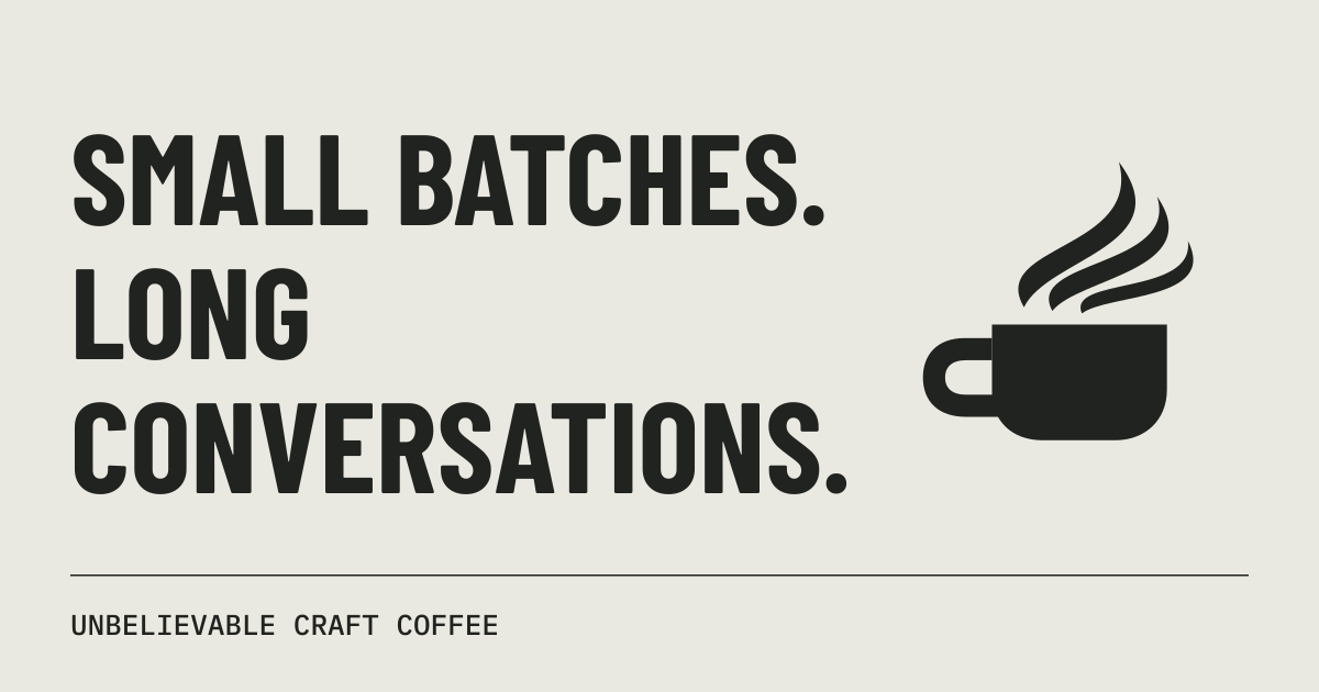 LINK PREVIEW / 1200 × 630 ↗
PNG exports are ready to place. Matching SVG masters are included for every asset. Nothing has been posted to a social account.
TYPE & COMPOSITION
- Barlow Condensed Bold for names and headlines.
- IBM Plex Sans for readable explanations.
- IBM Plex Mono for dates, weights and batch details.
- Use a simple ruled grid and one strong accent.
- Leave at least one cup-handle width around the mark.
WORDS & IMAGES
- Lead with flavor, origin and the person roasting.
- Use real roast facts. Keep personal tasting notes separate.
- Label generated packaging and mock weights clearly.
- UCC is personally created by Ryan. Based Beans is the AI blend.
- The website introduces the brand. Members use agents.